SHORT COURSE
Visual designers play a crucial role in digital accessibility - and it never has to come at the cost of great aesthetics. Every decision you make, from typography and colour palette to layout and interactive elements, either builds a bridge or creates a barrier. Designing for accessibility doesn't limit creativity; it amplifies it, ensuring your digital products can be used by everyone.

PART 1/10
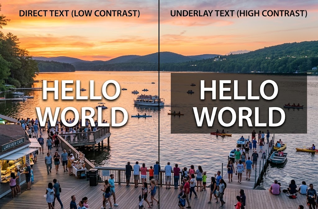
Placing text directly over imagery is a popular aesthetic choice, but it frequently creates critical barriers for users with low vision, color blindness, or cognitive fatigue. Dynamic backgrounds (like moving banners) or busy photography cause the background's contrast to fluctuate wildly behind the letters. This forces the brain and eyes to work significantly harder to separate the text from the image shapes. By introducing a solid graphic container, a dark overlay, or a dedicated text block, you ensure the text remains consistently legible to everyone - including someone trying to read their phone outside on a bright, high-glare day.
You are designing a hero banner for a website homepage. The client insists on using a vibrant, busy photograph of a crowded marketplace as the background, with the main promotional headline text written directly over the top of it. To ensure the text is accessible without completely hiding the photo, which approach should you take?
PART 2/10
Colour is a powerful tool for creating hierarchy and emotion, but it cannot be the only tool used to convey critical information. Millions of users experience some form of colour vision deficiency (colour blindness), while others might be using monochromatic screens or viewing a device in harsh lighting conditions. If a system relies entirely on a colour swap (like red for an error and green for success) to communicate meaning, these users are left completely in the dark. Designing with redundancy - meaning you back up colour changes with icons, explicit text labels, or distinct shapes - ensures that the core message is clear regardless of how a user perceives colour.
You are designing a complex data dashboard for a logistics company. When a shipment is severely delayed, the system currently highlights that specific row in bright red. How can you improve this design so that users with colour vision deficiencies (such as red-green colour blindness) can instantly identify critical delays?
PART 3/10
Good contrast between text and its background makes content easier to read for everyone, particularly users with low vision, colour vision deficiencies or when viewing a screen in bright sunlight. Insufficient contrast is one of the most common accessibility issues found on websites.
A brand's style guide specifies light grey text on a white background because it looks 'clean and modern'. What should you do?
PART 4/10
Typography affects far more than aesthetics. Decorative fonts, tightly spaced letters and very small text can significantly reduce readability, particularly for users with dyslexia, low vision or cognitive impairments.
Which typography choice is most likely to improve accessibility?
PART 5/10
Many people navigate websites using a keyboard instead of a mouse. Designers need to ensure interactive elements have a clear visible focus indicator so users always know where they are on the page.
Your developer asks if the default focus outline can be removed because it 'doesn't match the design'. What should you recommend?
PART 6/10
Buttons and other interactive controls should be large enough to activate easily. Small controls can be difficult for users with motor impairments, those using touch devices or anyone operating a device one-handed.
A mobile design includes tiny icon buttons placed very close together. What is the best improvement?
PART 7/10
Consistency helps users build familiarity with a website or application. When navigation, buttons and page layouts change unexpectedly, users must repeatedly relearn how the interface works.
Which design approach provides the best user experience?
PART 8/10
Users need to easily identify clickable elements. If links are styled exactly like surrounding text, many users will struggle to recognise them.
What is the best way to style hyperlinks within body text?
PART 9/10
Icons can simplify interfaces, but not every icon is universally understood. Relying solely on unfamiliar symbols can create confusion.
When should an icon include a text label?
PART 10/10
Animation can make interfaces feel engaging, but excessive or unexpected movement may distract users or even trigger vestibular disorders in some individuals.
A designer wants every page element to animate continuously to create a dynamic experience. What is the most accessible approach?
You've got this! Correct and incorrect answers will be indicated for each question, so take a moment to go back and check them. Your score and any questions you missed are shown below. If you didn't get top marks, don't worry—you're already a winner for taking the time to give it a go. Every question is an opportunity to learn. If you'd like to build your knowledge further or need more advanced guidance, we'd love to hear from you.
Never place text directly over busy images without ensuring sufficient contrast through overlays or text containers.
Don't rely on colour alone to communicate meaning - always reinforce it with text, icons or other visual cues.
Ensure text has sufficient colour contrast so it remains readable for everyone.
Choose clear, legible typography with appropriate size and spacing to improve readability.
Interactive elements must have a clear, visible keyboard focus indicator.
Design buttons and controls with large touch targets and adequate spacing.
Keep layouts and navigation consistent to reduce cognitive effort.
Make links clearly identifiable without relying on colour alone.
Use text labels alongside icons whenever their meaning may not be obvious.
Use animation sparingly and respect users who prefer reduced motion.